The end results are a series of files available here.
The hdf format of the individual tiles requires specific viewing software available here.
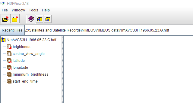
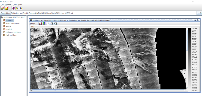
In processing files for this research I’ve used HDF View. Start by opening the file in the software:
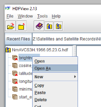
Once you’ve done that, right click on the ‘brightness’ option.
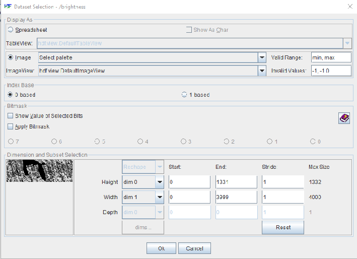
In the box that comes up, select the ‘Image’ radio button, then click OK:
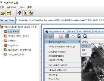
You’ll then get an image opening in the main window that you can save by clicking on the ‘Image’ text:
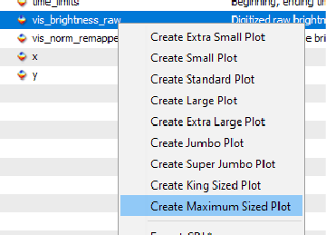
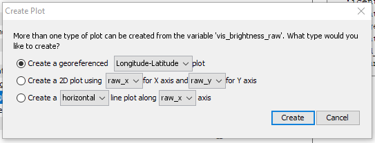
Right click on the ‘Digitised raw brightness count’ option and choose ‘Create Maximum sized plot’. You’ll get a pop up box with the default of ‘create a georeferenced longitude-
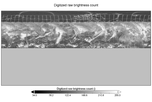
You’ll then be presented with a plot window based on the image data.
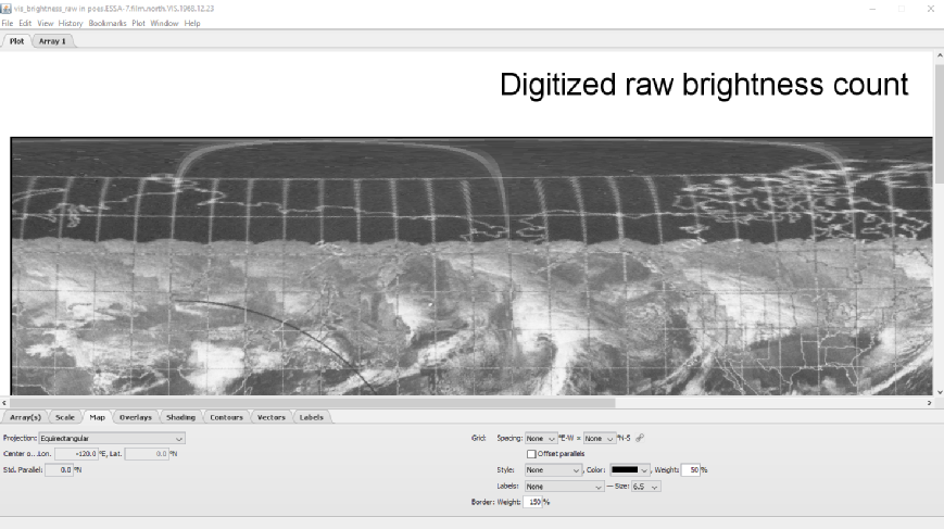
The first thing to do is to choose a Map Projection, and the best one to choose is the Equirectangular one. By all means experiment with the others available. I went through and turned off various options like gridlines and overlays, and when I’d settled on a format I was happy with I set it as the default. You can also change the position of the landmasses by altering the central longitude. Once you’re happy, save the image in your preferred format.
The images are of one hemisphere, so you need two files to cover the entire globe:
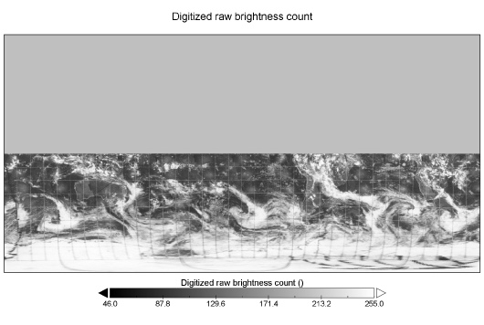
Use an image editing software package to combine the two layers into a single file. Now comes the fun part.
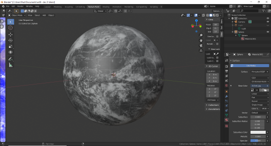
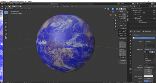
What we have here is a single file covering the Earth in a user friendly format. We also have a range of software packages out there that will allow us to plot that file on a 3D spherical mesh and rotate it so that it can match the images of Earth used in this report.
I’ve used Blender3D to do this, and it’s much too fiddly to describe in this document. Youtube has a range of tutorials available, and this one was very useful.
What you end up with, however, is a 3D globe like this. You can even try colouring the original files in the Panoply software, as shown on the right. These images were dated 21/12/68 during Apollo 8.
2.4 Modern Satellite Data reconstructions
For many years the data collected by satellites operating in the Apollo era remained buried in the journals and collections hidden in physical and online libraries.
Recently, however, a few researchers began to recognise the importance of these historic records and began to re-
Some researchers used the images as proxies for other things, for example the use of DMSP imagery to determine population growth and urbanisation. Some climate researchers, however, began to realise that the satellite data stored in archives represented an important climatic record, particularly in terms of the extent and characteristics of the Arctic and Antarctic ice sheets.
The USA’s National Snow and Ice Data Center (NSIDC) set about loading the tapes on which the original images were stored and began to process them into images, both individual tiles and composite full globe images. This youtube video describes the efforts.
The NIMBUS data can also be treated in the same way though as the whole Earth compilations tend not to include the poles a little more manipulation is required to get the projection right.
In addition to the original documents used in this report, I’ll be updating each page where appropriate to include a 3D rendered view to show how it matches the Apollo images even more clearly. There will be variations in appearance thanks to the way the software renders the images, anyone who denies that they aren’t a match is deluded beyond belief. The reason I’ve included this section is so that anyone who chooses to can verify that the files show what I claim they show.
The original data sets downloaded from NSIDC are part of this research:
Campbell, G. 2019. NOAA Polar-
and are copyright to to them, and no copyright is claimed here or should be inferred.
The end result is an image file which is of considerably better quality than the compilation volumes available on line or (as in the case of the volumes I own) in print.
Once the NSIDC team had finished with the NIMBUS data they moved on to the archive of ESSA images. The archive of data covers the compilation images, rather than the individual tiles, but the way that the images have been recovered allows much more to be done with them. The files are available here, and the images are in ‘.nc’ format that are best decoded using the free ‘Panoply’ software, available here.
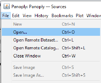
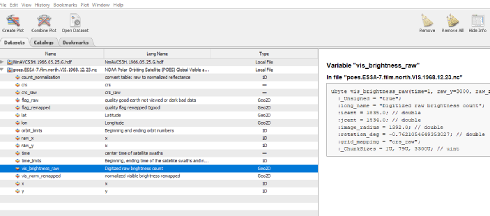
Install the software, then click ‘File’, ‘Open’ and browse to the file of your choice. You’ll then be presented with metadata in the software.