
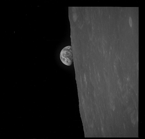
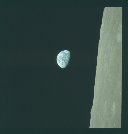
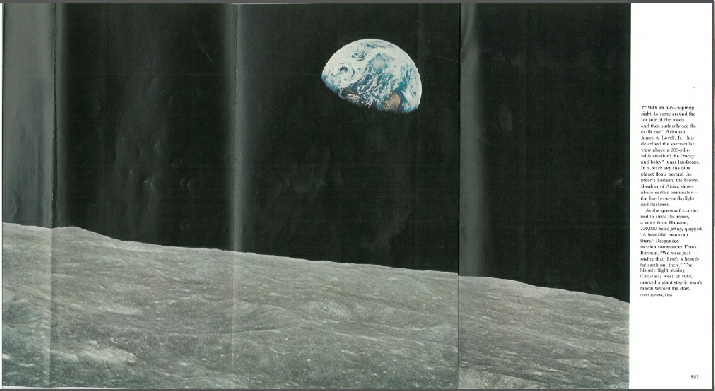
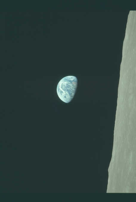
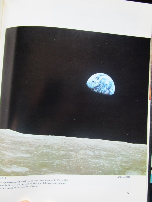
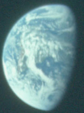
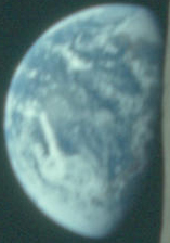
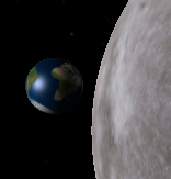
It’s one of the most famous photographs ever taken: the first image of Earth rising over the moon’s horizon as Apollo 8 orbited the moon in December 1968.
Some people would have you believe that the image is faked, that it never happened, when in fact all the evidence you need to prove it is genuine is right there in the image.
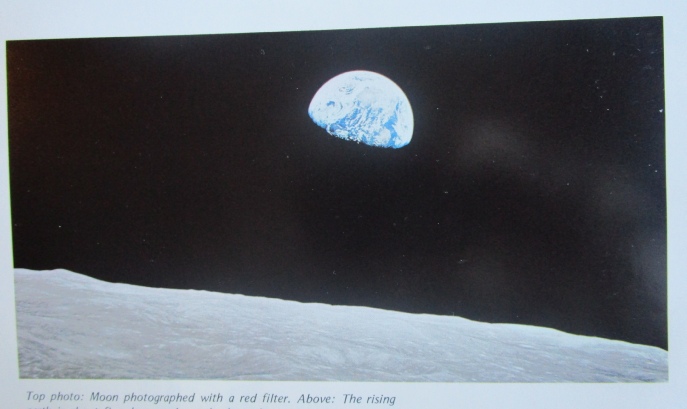
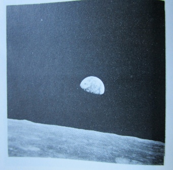
The first photograph taken is actually a black and white one, AS08-
We’ll deal mostly with the colour one, as this is the most commonly reproduced image.
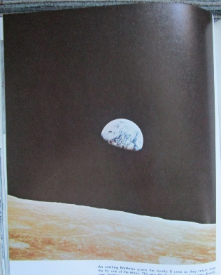
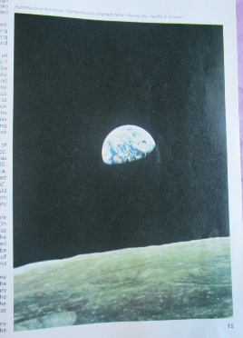
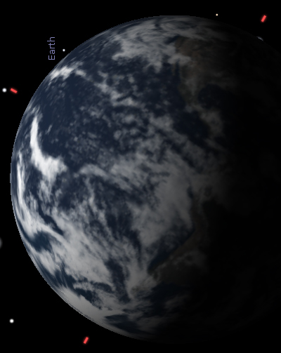
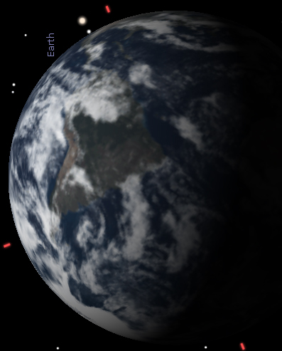
There are some people who don’t appreciate that the earthrise photograph has been around for decades and think that the only versions around are the ones you see on the internet. In order to dispel that myth here are some copies of my own from actual books, newspapers and magazines.
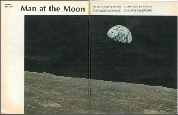
Life Magazine, January 20, 1969 (UK edition)
National Geographic, May 1969

Sunday Telegraph Magazine, January 10, 1969
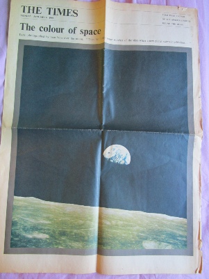
The Times, January 6 1969
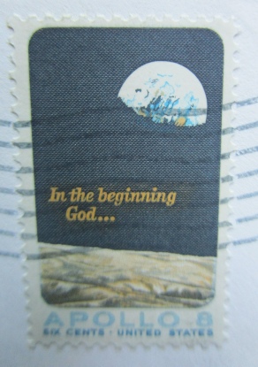
Apollo 8 stamp. This particular one was stamped on board USS Hornet, July 24 1969 after recovering Apollo 11. The first day of issue was May 5, 1969.
From the 1974 book “Man’s Greatest Adventure’.
From the 1975 NASA Book “Apollo: Expeditions to the moon”.
From the NASA report “Apollo 8: Analysis of Photography and visual observations”.
So, we get the idea -
You might find the odd mistake though, like the one from the 1969 ‘Moonslaught’ publication aimed at cashing in on the Apollo 11 launch. Sharp eyed readers will notice it’s the wrong way round! Likewise the advert in National Geographic for Aerospace company TRW, which is also reversed.
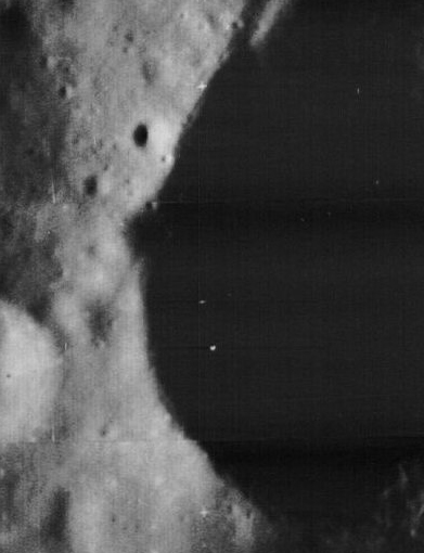
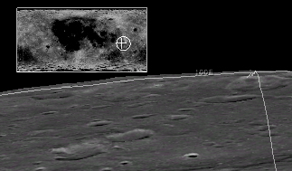
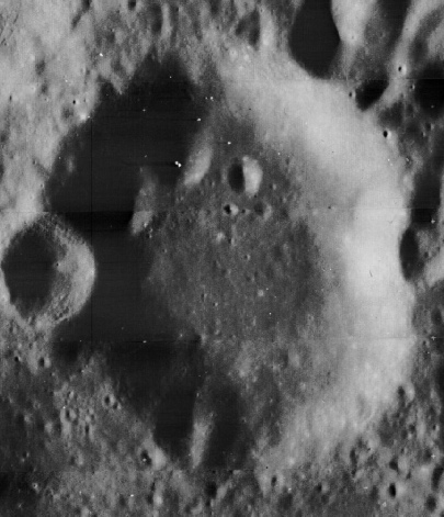
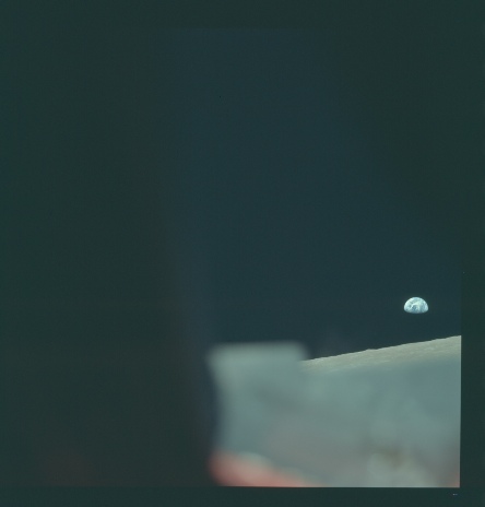
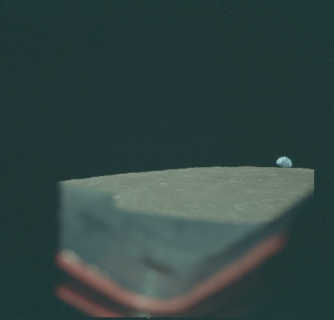
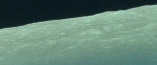
So let’s see what detail we can extract from the image itself. The most obvious feature in the foreground of the image is a bright crater on the edge of the edge of the photograph, cut in half by the framing. The crater itself is located at -
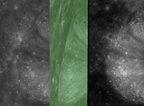
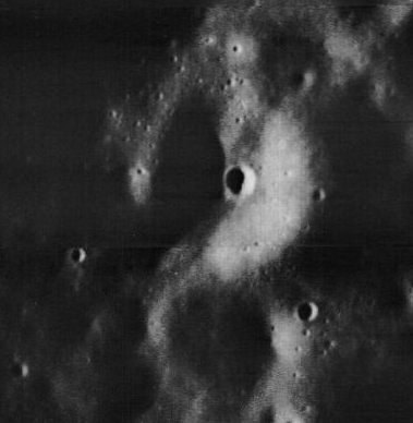
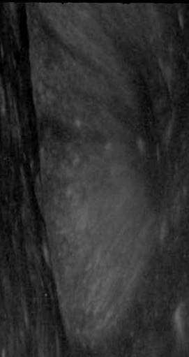
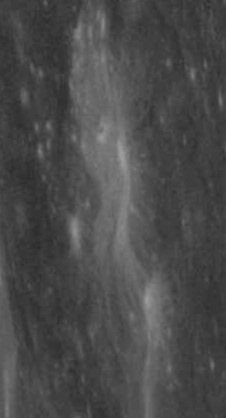
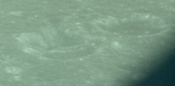
We can carry out a similar exercise for the small cluster of fresh craters at the other end of the foreground part of the photograph.
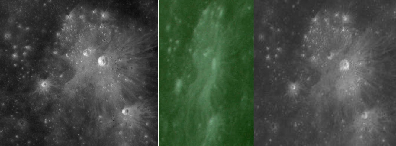
What anyone with eyes in their head should be able to notice from these two small sections of the larger image is that the craters in the Apollo image are exactly matched by the Chinese and Japanese images. Patterning on the ground from crater ejecta and on crater walls are also matched exactly in all the photographs.
The main point here is that not only is there an absolutely perfect correspondence between the Apollo and modern images, but there are no images prior to Apollo 8 that show these areas with the same level of detail. The best image we do have is from Lunar Orbiter 2, II-
It’s clear from this that the broad features in the Apollo image can be made out, but the difference in lighting means that there is no way that anyone could have know what was inside the craters, or what the ray patterns would look like in real life. The only well lit photographs are those that are from too great an altitude to show any surface detail.
We can extend this process even further into the distance by looking at Debus crater, just beyond the bright fresh crater we looked at first. China’s view is on the left, Japan’s (a composite of several smaller images) is on the right. Far right is the Lunar Orbiter view.
Looking at the changing landscape below are we seeing what we should be seeing?
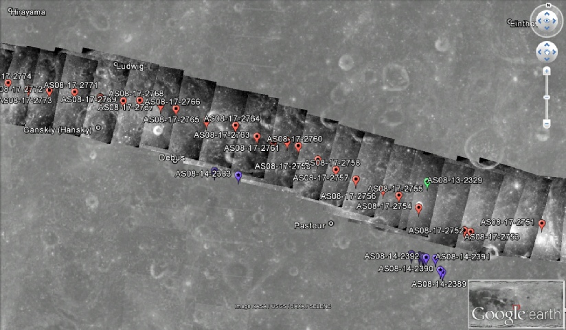
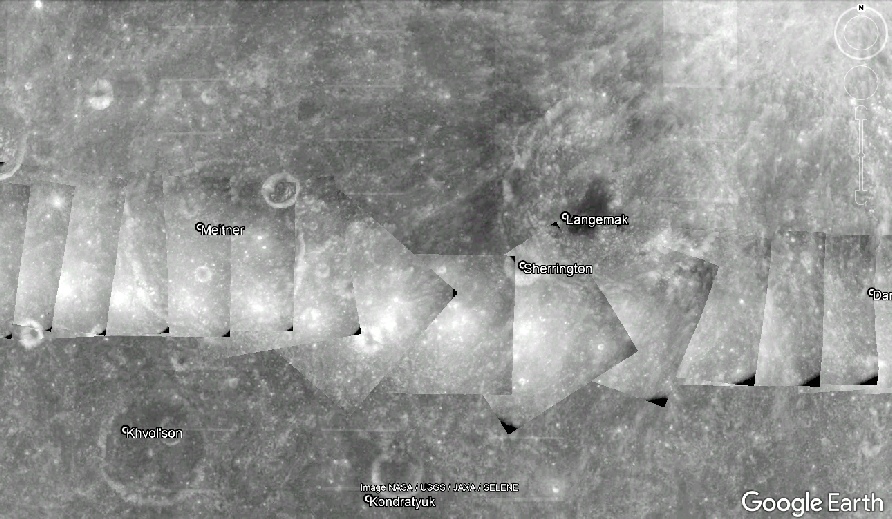
As the crew were approaching the point where Earth would be visible they had been photographing the lunar surface using a camera fixed in a Command Module window and operating on a timer. It was as they began a roll manoeuvre to change the orientation of the CM that they first saw Earth. The timing of this manoeuvre is recorded precisely in the mission, and if you look at the images being taken at the time plotted on Google Moon you can see the effect it had on the photographs.
The timing of the photographs is well documented and can be found at the Apollo Flight Journal, and the location of Apollo 8 when the photographs were taken is recorded in this video. From this data we can plot where they were above the surface, and derive a distance between those two points.
The bright crater in left of centre in the foreground of the image above right is the same one in the top right of the black and white Earthrise image.
Now, we have two photographs taken less than a minute apart but taken from spots roughly 3 degrees apart on the lunar globe. That changing viewpoint means that the Earth has apparently risen in the lunar sky. Has it risen correctly?
Well, using astronomical software we can check that out too. I’ve used Stellarium, and by putting the correct time and date of the photographs in and positioning the observer at a point where the Earth is rising on mission’s ground path, we can compare that with what the view is 3 degrees further down the line. Here are the two versions of that.
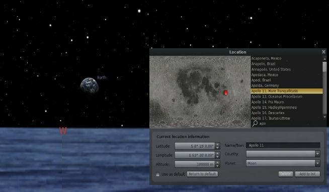
The water landscape has been chosen for no other reason than to guarantee a flat horizon.
As you can see it all looks pretty convincing. Notice that the longitude line is much closer to the meridian than the ones for the photographs taken from orbit. I hope the reason for that is obvious.
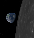
Is it correct though? OK, let’s put the Apollo 8 Earthrise image into it, matching the size of the Earth with the one in Stellarium. The Apollo image is partially transparent to allow you to see the Stellarium details more accurately.
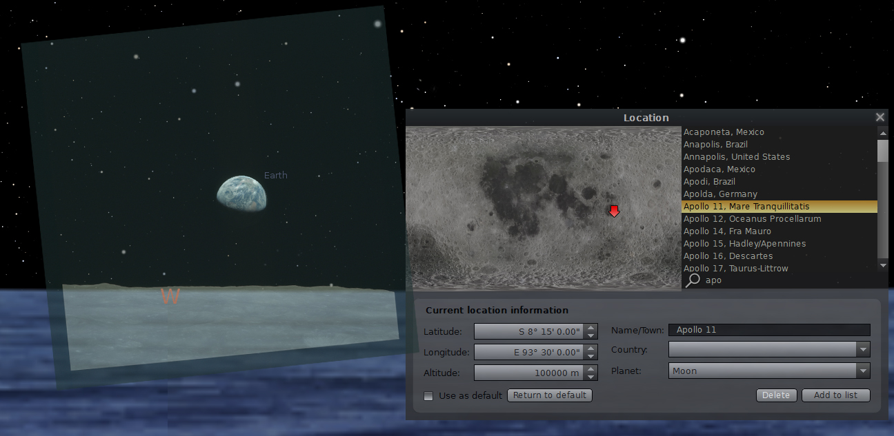
Absolutely spot on, again -
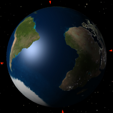
And what about the Earth itself?
As we know exactly when the image was taken we should be able to tell exactly what should be visible in terms of the landmass and position of the terminator. Here’s Stellarium’s view compared with the Apollo 8 photograph.
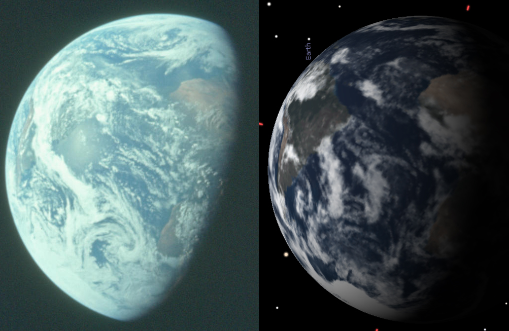
Pretty good results I’m sure you’ll agree, even if the WWT one isn’t the best quality and the STK one was difficult to position. All show Earth’s configuration to be the same as the Earthrise image.
And what about what can be seen in the image of Earth?
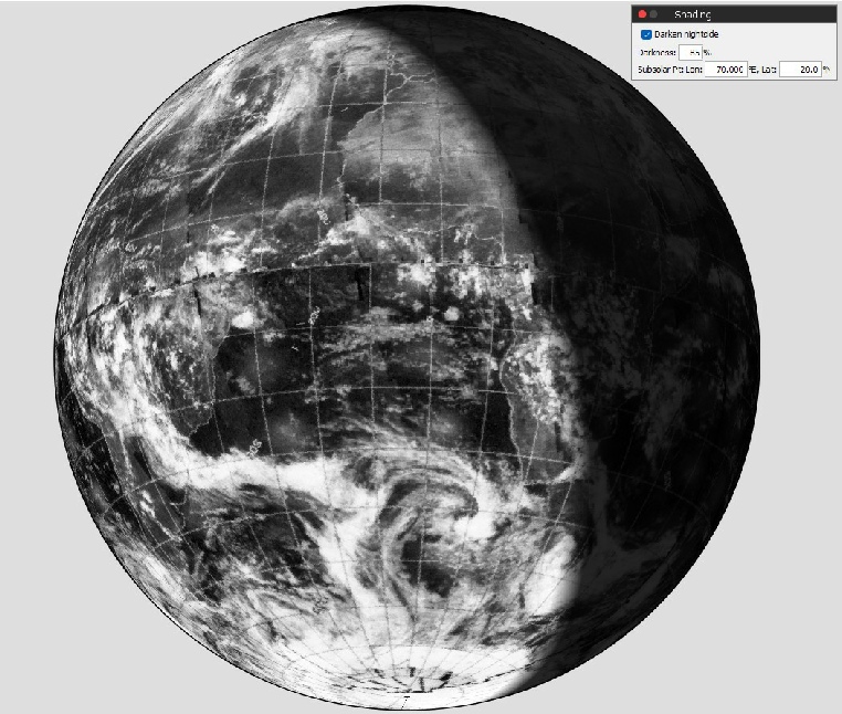
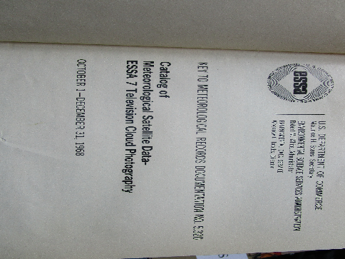
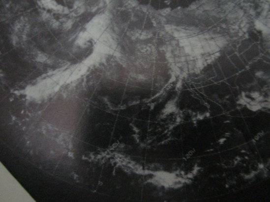
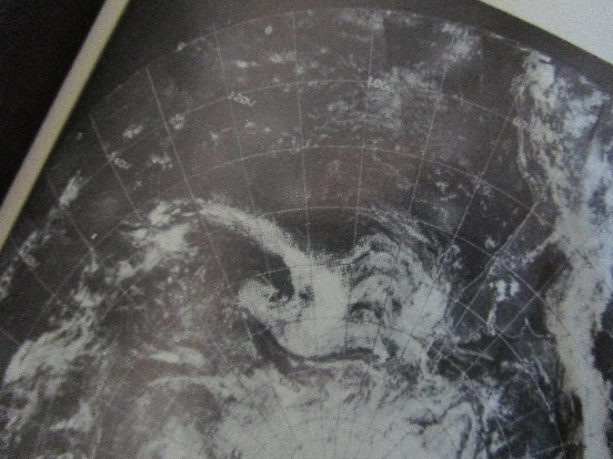
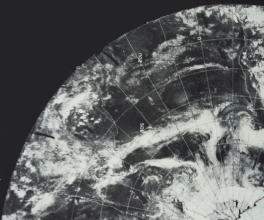
What we see in the image is a unique meteorological fingerprint of what was going on in our atmosphere during the mission. That meteorological fingerprint was recorded by a series of weather satellites, and I just happen to have a hard copy of one of the original books containing prints of the satellite images.
This is the one in question, and here are a few photographs if my copy to show that it was for sale to members of the public and that my copy was available for loan in a college library.

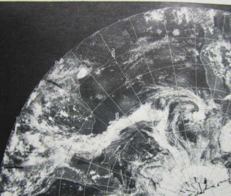
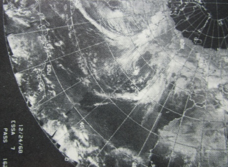
And here are photographs of the pages showing details in the Earthrise photograph, The images are dated December 24 1968, and thanks to the way the satellites worked the lit portion of the Earth would have been imaged over a period of several hours in the afternoon of that day. The portion photographed closest to the time represented by the Earthrise is the western limb of Earth.
There’s another useful bit of information in the image.
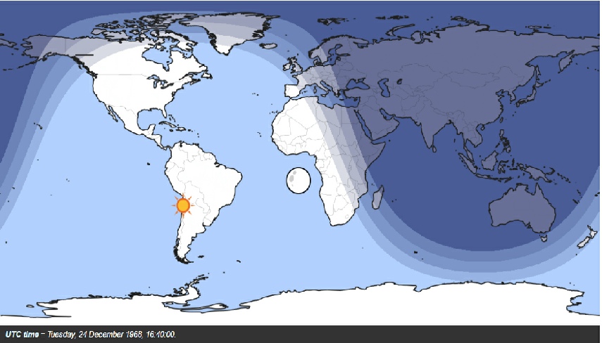
Notice the bright spot just off the coast of South America? That’s the reflection of the sun, and it gives us an additional clue about where the photograph was taken. Let me illustrate that.
If you put Stellarium’s viewer location as the sun and zoom in on Earth for the time Earthrise was taken it shows that the place with the sun directly overhead is somewhere off the west coast of south America (below left). Below right is an image from this website that shows definitively where this ‘subsolar point’ should be: along the Tropic of Capricorn (what with it being around the Winter solstice).
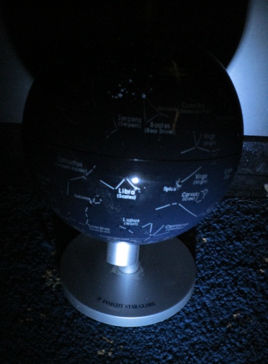
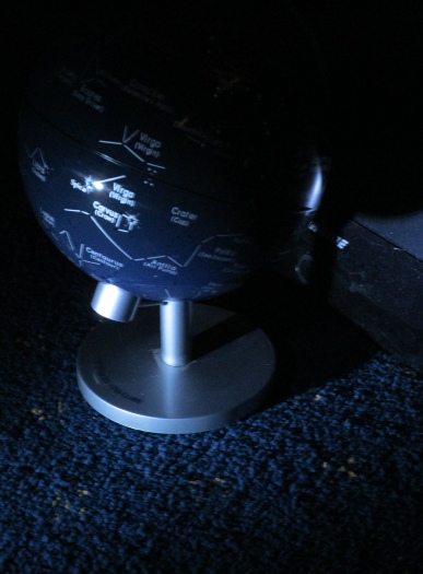
Apollo 8’s is obviously in the wrong place right? Well, if you look at the image below left you can see a globe I have lit by a torch in front of it. Below centre is exactly the same scene but viewed from the side. You should be able to see that by changing nothing apart from the position of the observer, the apparent location of the sun’s reflection has moved.
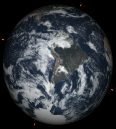
Using another piece of astronomy software (Celestia), we can predict where that reflection should be when viewed from the moon -
It’s a perfect match, almost as if they were there.
To summarise then, two images of one event contain all the information you need to work out that the Apollo 8 Earthrise photographs are absolutely genuine and in complete accordance with the historical narrative.
No rocket science was needed, no complex maths -
As a little post-
As before, the best view they had prior to Apollo 8 wasn’t lit in a way that allowed anyone to know what the distribution of patterns inside the crater is, yet somehow they acquired an accurate photograph -
It’s also worth mentioning that the first two areas are visible in the black and white Earthrise image -
From NASA’s 1971 ‘Lunar Photographs from Apollos 8, 10 and 11.
From 1969’s “Moonslaught”
Now for some back of the envelope calculations.
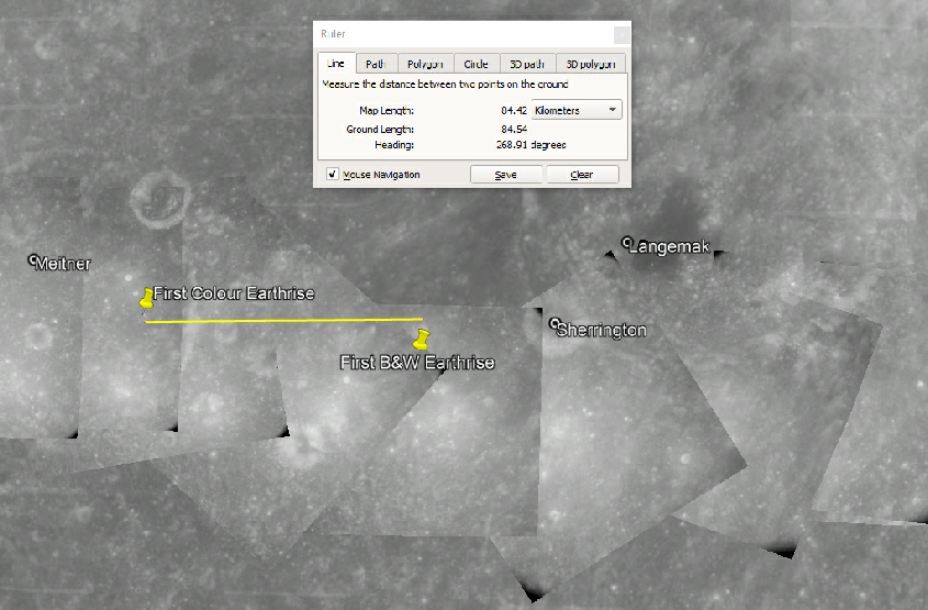
Apollo 8 was orbiting roughly 112 km above the surface, which when combined with a lunar diameter of 3474 km gives an orbital circumference of 11618 km.
The time between Loss of Signal (LOS) on orbit 3 and the same point on orbit 4 is 1 hour, 58 minutes and 36 seconds, or 7116 seconds. This equates to a speed of roughly 1.63 km per second. The time elapsed between the first black and white photo of Earthrise and the first colour one is 53 seconds, which means that they will have covered around 86.5 km between the two.
If you look up at the image above you’ll see that the measured distance is 84.4 km. I’m sure we could spend hours getting this down to 3 or 4 decimal places, but this all seems to be pretty much bang on the money.
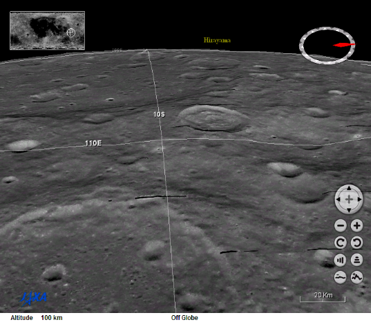
We can also use Japan’s 3DGIS rendering of the moon from their own surveys to look at the approximate view from 100 km up and roughly over the spot where they first took the photograph. Below left is the uncropped image, below right is the cropped and zoomed to match more or less what the photograph shows.
 Back Home
Advert from National Geographic Apollo 11 special.
AS08-
AS08-
And here they are in close up.
The two photographs were taken on different orbits to the original Earthrise photographs, and this is reflected in the change in what is visible in them.
The one on the left was taken on orbit 5, and as such will have been at around 18:36 on the 24th -
077:44:23 Lovell (onboard): Can you pitch up some more?
077:45:20 Lovell (onboard): No, that's about right. Let's take pictures of [garble]. You see the [garble] right there.
077:46:37 Borman (onboard): Houston, Apollo 8. How do you read?
…
077:46:48 Collins: Apollo 8, this is Houston. Over.
As AOS (Acquisition of signal) can only take place when Earth is in sight then we have the correct time for this one.
The second of our two was taken another couple of orbits later as judging by the amount of rotation visible in the changing view of Earth. Again we have confirmation in the transcript:
081:43:06 Borman (onboard): Oh, brother! Look at that!
081:43:16 Lovell (onboard): What was it?
081:43:18 Borman (onboard): Guess.
081:43:20 Lovell (onboard): Tsiolkovsky?
081:43:21 Borman (onboard): No, it's the Earth coming up.
81:43 equates to about 20:34 -
Both of them are absolutely spot on. The subsolar point in the first of these two is not visible thanks to it being over a cloudy Amazon basin, but in the second image you can see that it has reappeared exactly where it should be. By all means go the website I linked to above and check what should be directly below the moon when these photographs were taken. I guarantee they match.
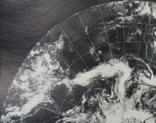
While the meteorological fingerprint for the first image in this postscript is pretty much covered by the satellite data shown for the first Earthrise photos, the second one has moved on by quite a bit. To confirm that the weather data are the same, here are some more photographs of my satellite imagery book.
As before, the meteorology images recorded on the day are a match for the meteorology depicted in the Apollo image.
The final thing to look at in these two images is what is visible on the lunar surface directly below Earth. It will come as no surprise to note that the same features visible in the first Earthrise sequence can also be found in these two.
It should be no surprise really, Apollo 8’s orbital parameters didn’t really vary over their short mission, and as can be seen from plots of all the images taken in orbit in Google Moon there is little variation in the ground covered.
Again, not only did the Earthrise images contain all the information needed to prove they were taken when and where claimed, but subsequent photographs taken over the next few hours add more proof.
We went to the moon.
And just so we’re clear, the weather satellite image from the 24th is different to that from the 23rd (below left) and the 25th (below right).
Couldn’t be more accurate if it tried.
We can even use this rather cool software, the WorldWide Telescope, to see what the view would have been like from orbit (below left) , Celestia (below middle) and the Systems Toolkit software used for testing orbital mechanics to do the same (below right):
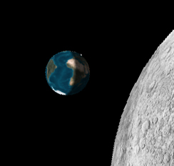
Celestia’s prediction shows that when viewed from the moon the sun’s reflection is exactly where it should be: just off Brazil. Celestia’s view of what should be visible, and the Earth’s orientation, also matches the Apollo photograph.
It’s also worth referring back to the image above from the web prediction of where the subsolar point is -
Still not convinced?
Well, this handy piece of software allows you to import images of Earth and project them on to any type of map surface you like, including a sphere. This site contains digitised scans of the ESSA images used above, and we can use those images to project onto a sphere. We can also put in the subsolar point to give the correct shading as well as the correct weather, like this: