5.2: You admit to doctoring the photographs
Now this I will spend a little time explaining, after I have made this clear (again):
I have never added to, or taken away from, any of the photographs used in this research. Ever. I have not manipulated any image in order to misrepresent its contents. Ever.
I am happy to state (and have said so in the text) that I have used some basic techniques to enhance images in order to make what is there clearer. This is entirely different from doctoring or faking.
I will now demonstrate those techniques so that readers can try it for themselves using a free image editing software package: GIMP, available for download here: http://www.gimp.org.
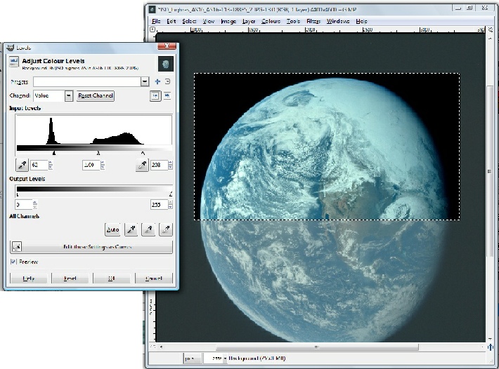
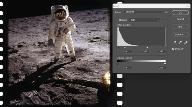
The main technique used is adjusting the 'levels' in an image. Any image can contain the balance of light and shade you want, but it can also contain light and shade that you don't want. Image editing software like GIMP contains a simple tool that allows you to remove unwanted brightness and dark areas. If you have ever had a photograph that looks very 'washed out', for example on a hazy summer day, you will find the following useful in removing that haze and revealing the image behind it.
As a worked example, I opened the high resolution GAP scan of AS16-
In figure 5.2.1 below, the tool is on the left and has already been applied by moving the two triangle markers in from the outer edges, and the effect on the selected part of the image should be obvious.
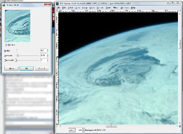
Next, I decided to add a little sharpening to the 'entrance to inner Earth'. The sharpening tool can be found in the 'Filters', 'Enhance' menu, and I have the chosen 'Unsharp Mask' tool. The operation of the tool can be seen in figure 5.2.2, and figure 5.2.3 shows the end result on a selection of the image. It's an easy one to overdo (as in this example) but can be useful in bringing out detail in blurred images. When it has been used in this research, I have identified it.
Figure 5.2.2: The Unsharp mask tool. Adjusting the 3 sliders alters the level of sharpening.
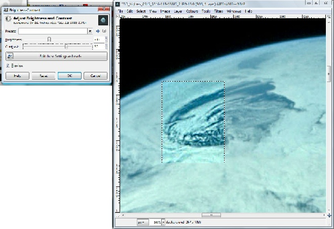
Now that it's been level adjusted and sharpened, let's have a quick look at contrast and brightness ('Colours', 'Contrast – Brightness' menu) in figure 5.2.4:
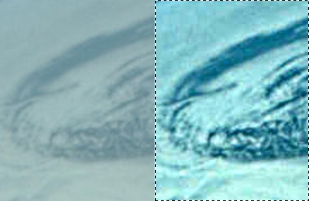
Figure 5.2.5 shows the end product of level adjustment, sharpening and contrast/brightness adjustment. It has been overdone for the purposes of this illustration, but it should be evident what the overall impact of this enhancement process is, and that nothing has been added or removed as a result. This particular image did not need anything other than level adjustment, but it can make the difference between important details being hidden or revealed in poor quality photographs.

So no, the use of an image editing programme does not constitute altering the content in the sense that conspiracy theorists would like to have you believe.
It might be relatively easy to manipulate an image, but that doesn’t mean that everyone is skilled at it, and sometimes poor use of those skills allows conspiracy morons to try and gain some mileage from it.
In one example of it, a particularly unpleasant moonhoax moron, who I’m not even going to name so that he won’t get any links from this page (suffice to say he may be an ex-
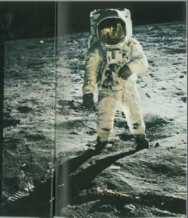
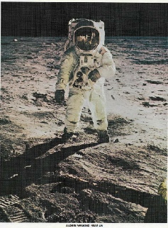
The image in question is AS11-
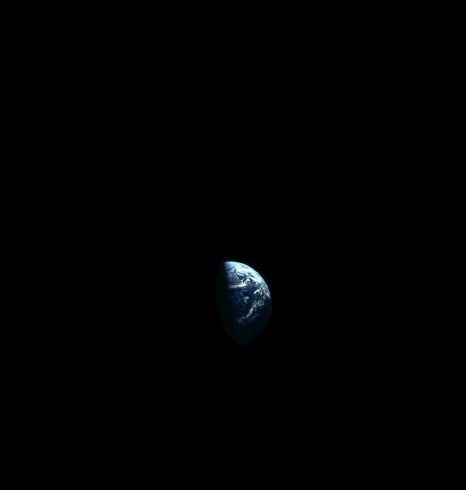
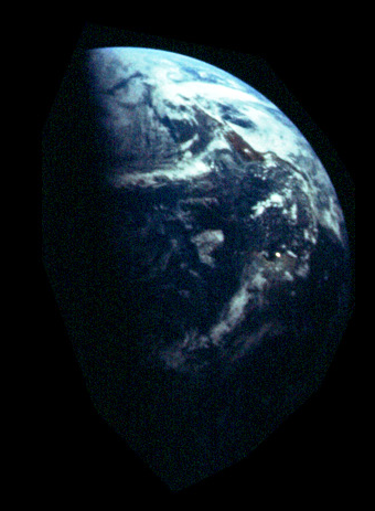
Figure 5.2.6: AS11-
Obviously someone has used the lasso tool very badly here, and has tried to compensate for the low exposure of the Earth in the original by enhancing the brightness of it.
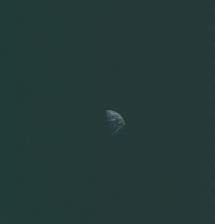
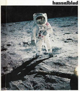
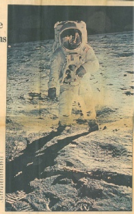
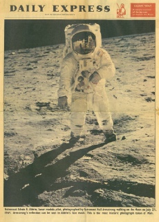
Can we sure that this is the case? Well, let’s have a look at other versions of the photograph available (figure 5.2.7).
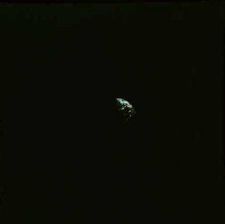
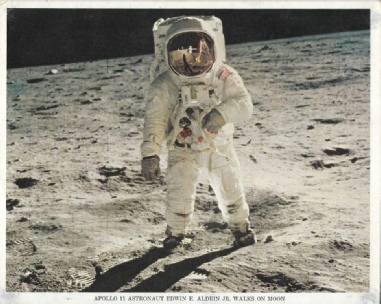
Figure 5.2.7: AS11-
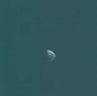
The image catalog (published in 1970) is a significant one, as it shows that the photographs were all available long before anyone could manipulate photographs as they can now. Hard copies of these volumes do come up for sale, eg here, and I own a copy of the one released for Apollo 12. It also publishes it correctly oriented (ie north at the top), which will disappoint our protagonist here as he claims NASA publish photos upside down on purpose to fool people.
It should be pretty obvious from these versions of the photo that the original Earth is under-
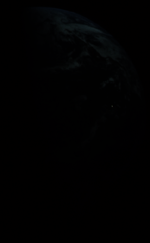
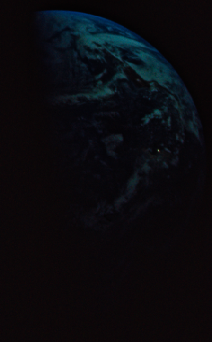
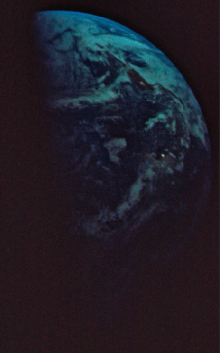
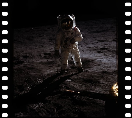
As can be seen in figure 5.2.8, a couple of applications of image enhancement and level adjustment reveals the Earth in all its splendour, including the lovely sunglint from Brokopondo reservoir. No sign of any differences between Earth and background here, because I didn’t use a lasso tool. Neither did whoever scanned the image at the Project Apollo Flickr archive. Apparently the not very brilliant troll claiming these are all fake images thinks I had something to do with that, and that I have altered the images. He claims this because he’s an idiot desperately clinging on to a delusional fantasy. Let me make it clear again: I have never added, or taken away, anything in any Apollo image, ever, and neither has anyone else.
You’ll also get people looking at other low resolution versions of other Apollo photographs of Earth and seeing things that to them are evidence of some sort of photoshopping, but in reality are image compression artefacts, or they’ll see the word ‘Photoshop’ in a scanned image’s metadata and cry foul, when the reality is that using Photoshop as an image processing tool doesn’t make an image fake, nor can it somehow magically alter the hard copy originals freely available during the Apollo era and that can be easily obtained now.
One such prime example is this one (figure 5.2.9), posted on a moon hoax facebook group:
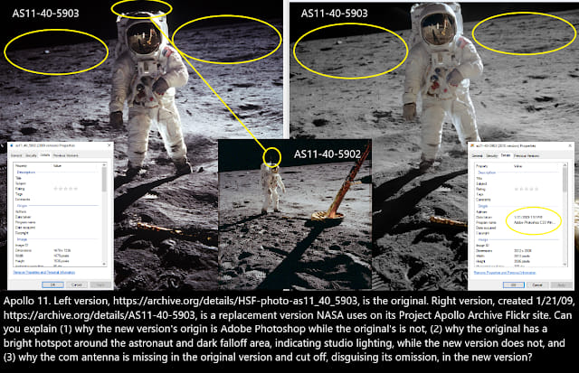
The accusation here is that the more recent scan has been edited to hide the fact that the aerial (pointed out in the other picture) is missing. According to this particularly idiot, the metadata shows that it hasn’t been through photoshop, so it is therefore genuine. Why, then, is there no aerial? Well, if the poster knew anything about the photography he would know that the Hasselblad positives were 70mm by 70mm, ie square. If you look at the image details for the one on the left you can see that it isn’t -

Figure 5.2.10: AS11-
You can very obviously see the dark line across the top where the photograph actually ends. The start pf the aerial is visible in any version of this image, including the many available when it was made freely available the public.
The fact is that the poster prefers the low resolution version on Archive.org because it confirms his preconceptions. He’s wrong. The versions showing black above the astronaut are either there because of the way they’ve been scanned or because of the way newspapers and magazines prefer a portrait format and added the black themselves. NASA’s original has always been nice and square, and cropped out the aerial. You’ll also find plenty of examples where the public version of the image isn’t the same as that on the original positive (see figure 5.2.11).
Figure 5.2.9: A meme from social media, example source.
We’ll try and avoid being all meta about things and discuss whether the scan of a positive is the same as the positive (and even the positive here is a a positive of the original positive!), but all of them differ depending on how they were reproduced, the medium on which they were published and also how they were scanned. The fact is that not one of them shows any difference in the actual content of the image, just how that content appears, and all of them pre-
The poster also seems to think the Project Apollo Flickr site is run by NASA. It isn’t.
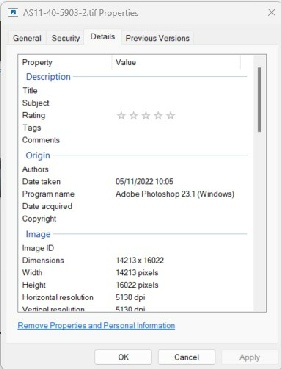
Just to labour the point a little more, figure 5.2.12 shows the original TIFF image as shown at March to the moon, together with it’s metadata. It also shows some very basic image processing and the resultant metadata.
Notice how the original has no Photoshop metadata. Notice also that the bottom one is much easier to see, and now has Photoshop metadata, Nothing has been added or removed from this image.
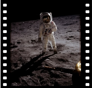
Oh, and that bright spot that the hoaxers love to make such a big deal over? Well, they’re kind of ignoring the large reflective object Aldrin’s standing next to. See this video for an excellent examination of that claim.
Another internet user draws attention to another ’suspicious’ feature of the the images, namely the “disjointed oblong pattern” he observes in AS11-

It should be obvious here that the degree of blockiness is much higher in the down-
The fact that odd patterns and swirls exist outside the image itself should tell you that it’s a product of the scanning process -
What these people are trying to do is divert attention away from what’s in the object: in our case, Earth. An Earth that contains details that can be proven to match what we should be seeing in terms of the landmasses visible, the position of the terminator, and the weather features visible on it.
An Earth that matches what should be seen so exactly it can only have been taken during the Apollo mission. An individual photograph of Earth amongst many other, equally accurate images of Earth that exactly conform to the mission timelines. They have no explanation for the existence of these photographs and hope to distract the unwary by cherry picking individual examples, ignoring obvious explanations, and failing to understand things so spectacularly that they are either being deliberately dishonest or they need help tying shoelaces.
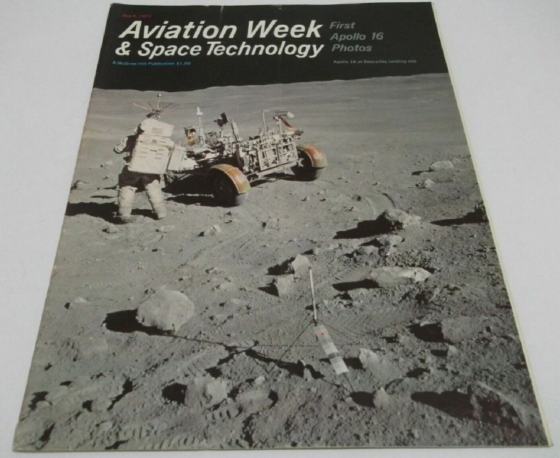
The other obsession with photoshop is an idea that all the original photographs were somehow replaced in (ooh let me see, pick a date at random) 2009, roughly about the time when a serious effort to present a more complete Apollo archive happened. Hence we get things like that shown in figure 5.2.17.
It is unusual, and it does occur in numerous scans at the March to the Moon site, but what is it? Well, again we have to go back to the fact that this is not an original image. It is a scan of a film positive, itself a photograph of the original film, done on a pretty high powered digital scanner (figure 5.2.14).
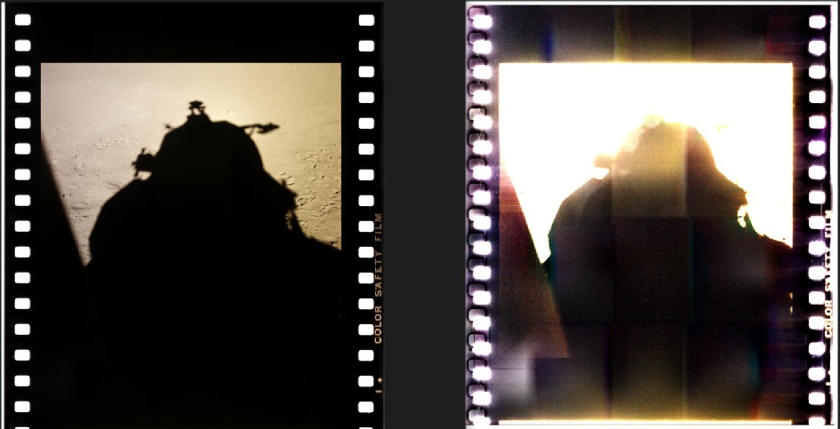
Figure 5.2.13: AS11-
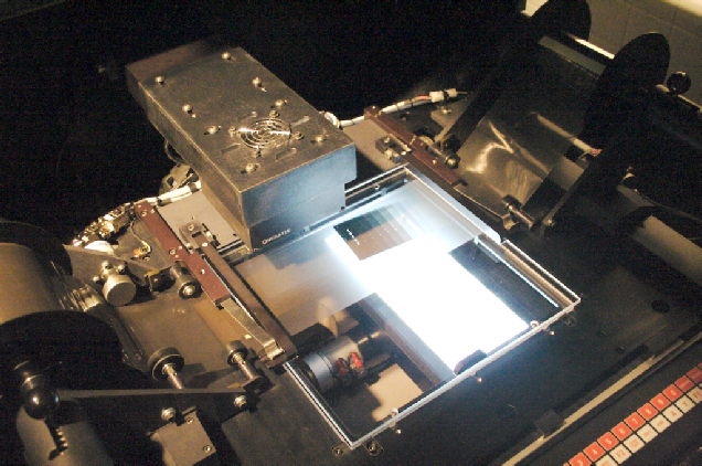
Figure 5.2.15: Leica DSW700 scanner with film loaded.
Those scans are done at pretty high resolution, and then down-
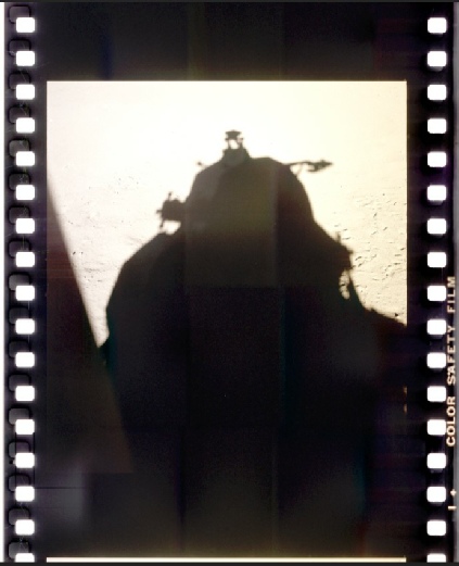
Figure 5.2.16: Full size raw scan (left) sand down sampled PNG image (right), both showing the effects of brightness level adjustment.
Figure 5.2.1 – Level editing tool in GIMP
Figure 5.2.3: After applying 'Unsharp Mask'
Figure 5.2.4: The contrast/brightness tool, showing the impact on a selected area.
Figure 5.2.5: The original section of the GAP image with no alterations (left) and the finished product (right).
Figure 5.2.8: Earth from the scan of the Kodak positive untreated (left) initial treatment (centre) and final level adjustment (right)
Figure 5.2.11: AS11-
Figure 5.2.12: Original Hi-
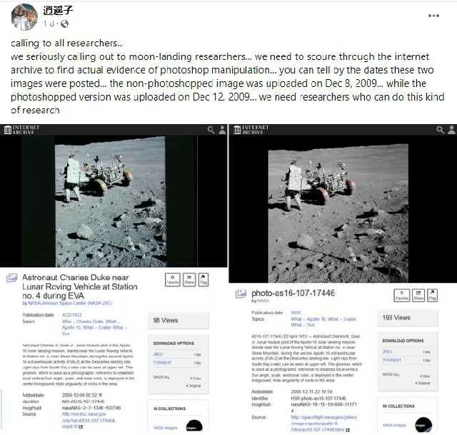
Figure 5.2.17: Social media claims about Apollo images.
What we have in the post is a nice bit of confirmation bias. Apparently you need to get the older photographs because they haven’t been altered in any way, unlike the modern ones that are somehow different. Alternatively, there is no actual difference between the original and the scan other than the presence of artefacts introduced by the scanning and image compression process. The famous ‘C’ in this image, for example (very obviously a fibre when examined closely), isn’t in the original, and these older non-
So no, they didn’t remove it because they were ‘tired of answering questions’, it just isn’t there in all original versions of it.
Any claim by any moon-
Here’s the deal: if you think the images were faked, you need to prove it. If you think I, or anyone else, somehow altered the images online or in 50 year old documents to add or remove things, then prove it. Stop whining about Photoshop, or people hacking your computer, or claiming that images have been replaced to hide something, provide some proof. You won’t be able to, mostly because there’s nothing to find, but partly because you don’t want to.
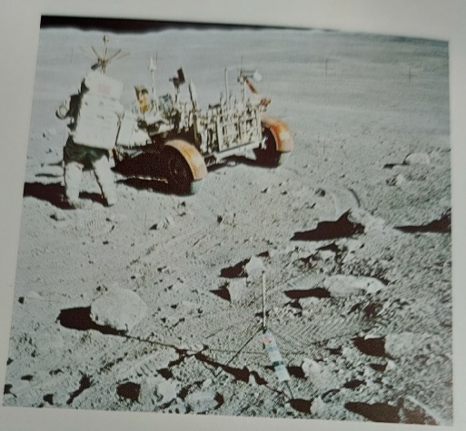
Figure 5.2.18: AS16-